

ADA tactile signs, the room and restroom signs with raised letters and Braille, mount so the raised text sits between 48 and 60 inches above the floor. You measure to the baseline of the text, not to the sign plate, and the sign goes on the wall beside the latch side of the door. Visual-only signs need their text at least 40 inches up, and accessible parking signs need their bottom edge at least 60 inches above the ground.
Those numbers come from the 2010 ADA Standards for Accessible Design, mainly sections 216, 502.6 and 703. The rest of this guide walks through which signs the rules cover, where each one goes and what has to be on it, in the order you would plan a building.
Which signs the ADA rules cover
Not every sign in a building falls under the same rules. Section 216 sorts them by job, and the job decides what the sign needs.
Signs that name a permanent room or space are the strictest group. The standard calls them designations. Think room numbers, room names, restroom signs and floor numbers: labels that are not likely to change over time. These need raised characters, Grade 2 Braille and the visual rules on contrast and finish. Doors at exit stairways, exit passageways and exit discharge need the same tactile signs.
Signs that point the way or give information about a space are a lighter group. A “Conference Rooms” arrow, a sign listing rules of conduct, or an occupant load sign only has to meet the visual character rules in 703.5. No Braille, no raised text.
Some signs are left out of section 216 entirely. The exceptions list building directories, menus, seat and row designations in assembly areas, occupant names, building addresses, and company names and logos. Temporary signs posted for 7 days or less are also exempt. So the name plate with a tenant’s name on it does not need Braille, but the suite number beside it does.
A few other signs show up in specific places: the International Symbol of Accessibility at accessible entrances when not every entrance is accessible, parking space signs, and signs for assistive listening systems in assembly areas that need them. Elevator hoistway entrances get tactile and Braille floor designations on both door jambs, with the raised characters at least 2 inches tall, under section 407.
| Sign | Raised text and Braille | Visual rules |
|---|---|---|
| Room number or name | Required | Required |
| Restroom ID | Required | Required |
| Exit stair door | Required | Required |
| Directional or info | Not required | Required |
| Directory, menu, logo | Exempt | Exempt |
A good ADA sign package starts with this sort. Walk the floor plan, mark every door that leads to a permanent room, and you have the list of signs that need Braille. Everything else is either a visual sign or outside the rules. The sort also tells you where the money goes: tactile signs cost more to make than flat printed ones, so getting the list right keeps you from paying for Braille on a sign that never needed it, or skipping it on one that did.
The 48 to 60 inch rule for tactile signs
Section 703.4.1 sets the mounting height for any sign with tactile characters. The baseline of the lowest line of raised text must be at least 48 inches above the finished floor. The baseline of the highest line of raised text can be no more than 60 inches above it.
Two details trip people up. First, the measurement is to the text baseline, the line the letters sit on. It is not to the bottom edge of the sign, the top edge, or the center. A tall sign with a large blank margin at the bottom can have its plate start well below 48 inches and still comply, as long as the lowest line of raised letters sits at 48 inches or higher.
Second, it is a window, not a single number. A one-line room sign has plenty of room inside it. A sign with a room name, a room number and a line of Braille under each has to fit all of its raised text between 48 and 60 inches, with the Braille below the text it matches, so the layout gets tighter. It also helps to pick one height for every door in a building so the signs line up down a hallway.
The one exception in 703.4.1 is elevator car controls, the buttons inside the cab, which follow their own rules.
The diagram puts those heights on one wall. Notice that the tactile window sits inside the 27 to 80 inch zone where, under section 307, nothing on a wall may stick out more than 4 inches into the walkway. A tactile sign is a flat panel close to the wall, so it fits easily.
Where the sign goes beside the door
Height is half of it. Section 703.4.2 also says which side of the door the sign goes on, and the reasoning is practical: someone reading by touch needs to find the sign in a predictable place and should not get hit by the door while reading it.
Single doors. The sign goes on the wall alongside the door, on the latch side. That is the side with the handle, opposite the hinges.
Double doors with one active leaf. The sign goes on the inactive leaf, the door that normally stays closed.
Double doors with two active leafs. The sign goes to the right of the right-hand door.
No wall space. If there is no wall at the latch side of a single door, or to the right of double doors, the sign goes on the nearest adjacent wall.
Push side of the door. The standard permits a tactile sign on the push side of a door that has a closer and no hold-open device. You see this on restroom doors, where the sign is mounted on the door itself.
Then there is the clear floor space. Wherever the sign ends up, the standard requires an 18 by 18 inch clear space on the floor, centered on the tactile characters, outside the swing of the door from fully closed to 45 degrees open. In plain terms, a person standing in front of the sign to read it should be outside the path of a door that someone opens. A sign placed too close to the hinge side, or tight to a door frame that swings toward it, can fail this even at the right height.
This is where planning ahead pays off. Door swings, light switches, fire alarm pulls and thermostats all compete for the same strip of wall beside the latch. On a new build or a renovation, it helps to mark sign locations on the drawings before the electrician sets boxes. On an existing building, the installer has to work around what is there, which is part of why sign installation for ADA work starts with a walk of every door.
What has to be on a tactile sign
Location gets the sign found. The content rules in section 703 make it readable by touch and by sight. Here is what the standard asks of the raised characters on a room or restroom sign:
- Depth. Raised at least 1/32 inch above the background.
- Case and style. Uppercase only, sans serif. No italic, oblique, script or highly decorative letters.
- Height. At least 5/8 inch and no more than 2 inches, based on the uppercase letter I. If the same information also appears in separate visual characters, the raised characters can be as small as 1/2 inch.
- Proportions and spacing. The standard limits stroke thickness, the width of letters relative to their height, and the space between letters and lines, so the letters can be told apart by touch.
The Braille has its own section. It must be contracted, which is Grade 2 Braille, with domed or rounded dots in the sizes and spacing set out in Table 703.3.1. It goes below the text it matches. If the text runs to several lines, the Braille goes below all of it, and it must be separated at least 3/8 inch from other tactile characters and from raised borders or decorative elements.
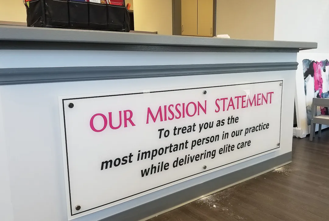
Finally, the sign has to work for someone with low vision. Section 703.5.1 requires a non-glare finish on the characters and the background, and contrast between them: light characters on a dark background or dark characters on a light background. Glossy acrylic that throws a reflection from overhead lights is a common way to miss this one.
ADA restroom signs and pictograms
Restroom signs follow the same height and location rules as every other room sign: raised text between 48 and 60 inches, measured to the baselines, on the latch side wall or, for doors with closers and no hold-open devices, on the push side of the door. Most questions about restroom signs are really about the pictogram.
The 2010 Standards do not require a pictogram on a restroom sign. The text “WOMEN” in raised letters with Braille below is a complete restroom sign. If you do use a pictogram to identify a permanent room, sections 216.2 and 703.6 add three rules:
- The pictogram sits in a field at least 6 inches tall, and no characters or Braille go inside that field.
- The pictogram and its field need a non-glare finish and the same light-on-dark or dark-on-light contrast as text.
- A text descriptor goes directly below the pictogram field, in raised characters with Braille, mounted to the same 48 to 60 inch rule.
The International Symbol of Accessibility, the wheelchair symbol, is a separate question. Under section 216.8, it is used to mark the accessible toilet room in existing buildings where not every toilet room is accessible, and in some clustered single-user restroom layouts. Where every restroom is accessible, the standard does not call for it on each door. The advisory to 216.2 also notes that the symbol does not need a text descriptor.
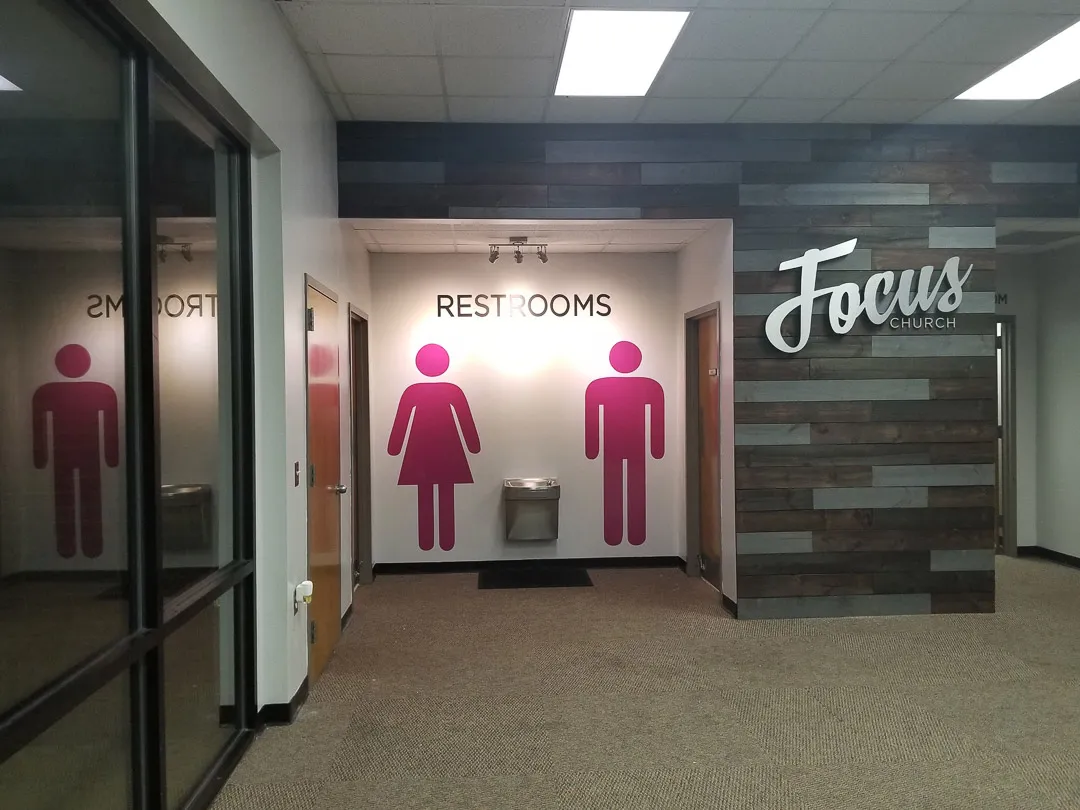
Decorative restroom graphics like the ones above are common, and they are fine to add. They are not a substitute for the tactile sign. A building can have a bold printed mural on the restroom wall and still needs a compliant room sign beside the door with raised text and Braille. If you are planning a full interior sign package, it helps to design the decorative and the tactile signs together so the colors and type match.
Visual signs, overhead signs and directories
Signs that only need the visual rules have more freedom. Upper and lowercase letters are allowed, and the style just has to be conventional in form. The key height rule in section 703.5.6 is short: visual characters must be at least 40 inches above the floor. There is no maximum. What changes as a sign goes higher is how big the letters must be.
Table 703.5.5 ties minimum letter height to how high the text is mounted and how far away the reader stands. Character height is measured on the uppercase letter I, and viewing distance is the horizontal distance from the text to whatever stops someone from walking closer. The table below shows the starting point for each band, before any extra distance is added. A sign mounted beside a door, 48 to 60 inches up, falls in the first row.
| Text height above floor | Viewing distance | Minimum letter height |
|---|---|---|
| 40 to 70 in | Under 72 in | 5/8 in |
| Over 70 to 120 in | Under 180 in | 2 in |
| Over 120 in | Under 21 ft | 3 in |
At longer distances in each band, the letters grow by 1/8 inch for every foot past the distance shown. That matters for wayfinding signs hung from the ceiling or mounted high on a wall at the end of a long corridor.
Overhead and projecting signs also have to respect the protruding object rules in section 307. Anything mounted with its leading edge between 27 and 80 inches above the floor can stick out no more than 4 inches into the walkway, because a cane sweeping the floor will not find it. Hanging signs need at least 80 inches of clearance underneath. So a blade sign in a hallway either stays flat to the wall or goes up high enough for people to walk under it.
Directories, menus and company logos are exempt from section 216, as covered above. That gives you room to design the lobby directory or the logo wall freely, though good contrast and readable type still help every visitor.
Accessible parking sign height
Parking signs are the one place the standard measures to the bottom of the sign instead of to the text. Section 502.6 says accessible parking space identification signs must be at least 60 inches above the finished floor or ground, measured to the bottom of the sign. The point is that a car parked in the space should not hide the sign.
Each sign carries the International Symbol of Accessibility. Signs for van spaces add the words “van accessible.” Section 216.5 adds two exceptions: sites with four or fewer total parking spaces do not have to identify the accessible space with a sign, and residential facilities where spaces are assigned to specific dwelling units do not have to either.
The advisory to 502.6 points out that enforcing parking privileges is a local matter. Fines, tow-away language and any extra panels on the post come from state and local rules, not from the ADA Standards.
North Carolina codes and your building official
The 2010 ADA Standards are a federal civil rights standard. For public accommodations and commercial facilities, they apply to new construction and alterations when the last building permit application was certified complete, received, or construction started, on or after March 15, 2012, according to the Department of Justice’s compliance date guidance.
They are not the only rules your signs answer to. North Carolina’s state building code and your local building official enforce their own accessibility and life safety requirements during plan review and inspection, and they can add to what the ADA asks for. Before you order signs for a new building or a renovation in Raleigh, Durham, Cary or anywhere else in the Triangle, ask your architect or the permit office which code edition applies to your project. Where two rules differ, plan to meet the stricter one.
Getting ADA signs made and installed in the Triangle
Raleigh Sign Solutions makes room, restroom, stairwell and elevator signs with raised text and Grade 2 Braille, and installs them to the height and location rules above. As our ADA and Braille signs page notes, a single room sign typically runs $30 to $150 depending on material, and a project usually takes 2 to 4 weeks from approval to installation. Those are typical ranges, not quotes: your price depends on the number of signs, sizes, materials, any custom colors or inserts, and the building.

ADA signs rarely stand alone. In a medical or dental office, exam rooms, restrooms and staff areas all need room signs that match the reception sign. In an office building, suite numbers, conference rooms and stair doors need them alongside tenant directories and lobby signs. If you are still planning the rest of the building, our guides to types of business signs and what a business sign costs cover the exterior side.
To get started, send us your floor plan or a list of rooms through the quote form, and we will sort which signs need tactile text and Braille before anything gets made.
Frequently asked questions
How high do you mount an ADA sign?
Under the 2010 ADA Standards, the raised text on a tactile sign must sit with the baseline of the lowest line at least 48 inches above the finished floor and the baseline of the highest line no more than 60 inches above it. The rule measures to the text, not to the edges of the sign plate.
What is the ADA restroom sign height?
The same as any other room sign: tactile text between 48 and 60 inches above the floor, measured to the text baselines. The sign goes on the wall beside the latch side of the door. On a restroom door with a closer and no hold-open device, the standard also allows the sign on the push side of the door itself.
How high does a handicap parking sign need to be?
Section 502.6 of the 2010 ADA Standards says accessible parking identification signs must be at least 60 inches above the ground, measured to the bottom of the sign. The sign shows the International Symbol of Accessibility, and van spaces add the words "van accessible."
Do all signs in a building need Braille?
No. Braille and raised text are required on signs that identify permanent rooms and spaces, such as room numbers, restrooms and exit stair doors. Directional and informational signs need to meet the visual rules only. Building directories, menus, occupant names, company names and logos, and temporary signs posted for 7 days or less are exempt from the sign section entirely.
What if there is no wall beside the latch side of the door?
The standard says to put the sign on the nearest adjacent wall. Wherever it ends up, it still needs an 18 by 18 inch clear floor space centered on the tactile text, outside the swing of the door from closed to 45 degrees open.